Color Image Segmentation
Image segmentation is the isolation of a region of interest (ROI) from its background. If the ROI has the same grayscale values as the background, proper segmentation cannot be done in grayscale by thresholding.
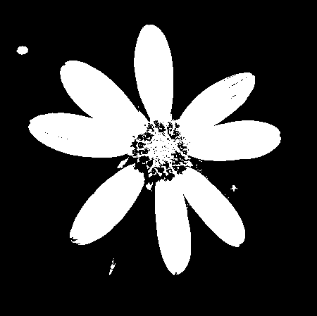
Consider the image below, where the apples are the region of interest. By inspection of its histogram and its grayscale version, it is apparent that the color of the ROI is almost the same as the background.

Figure 1. Image to be segmented. Courtesy of http://extension.missouri.edu/publications/DisplayPub.aspx?P=G6021

Figure 2. Image converted to grayscale.

Figure 3. Histogram of the image to be segmented.
Since 3D objects have shading variations, it is better to represent color space into brightness and chromaticity information. Such color space is the normalized chromaticity coordinate (NCC). Each pixel is represented by I = R + G + B thus the normalized chromaticity coordinates are


and transform color RGB into NCC using the equations above.
ROI = imread('patch.jpg');
R = ROI(:, :, 1);
G = ROI(:, :, 2);
B = ROI(:, :, 3);
I = R + G + B;
r = R./I;
g = G./I;
Parametric segmentation
In parametric segmentation, the probability p(r) that a pixel with chromaticity r belongs to the region of interest is given by

A Gaussian distribution is assumed along r and g, and the mean and the standard deviation are computed from the pixel samples.

Figure 5. Parametric segmentation.
Non-parametric segmentation
For non-parametric segmentation, the 2D histogram of the region of interest was obtained to be used for histogram backprojection. To test if the histogram is correct, the locations of its peaks can be compared to the rg chromaticity diagram as shown in Figure 6.

Figure 6. 2D histogram of the region of interest.

Figure 7. Normalized chromaticity space.

FIgure 8. Non-parametric segmentation
Comparing the results of both methods, I would say that parametric segmentation is better because the image was smoother and cleaner.
I give myself 9/10 for this activity.
Color Camera Processing
Images captured using a colored camera can sometimes come out with an unsightly blue, orange, or green color cast to them even though the original scene looked normal. Proper white balancing removes these unrealistic color casts so that white objects in the image appear white and the other colors are properly rendered. Our eyes automatically adjust to colors under different sources of light, however cameras usually have difficulty in automatic white balance. Thus digital cameras now have different white balance settings appropriate for different illumination conditions under which an image will be taken. They give rough estimates for the actual lighting they work best under.
Shown below are images of colored papers under daylight fluorescent lighting. A Samsung BL103 digital camera was used to capture the photos under different white balancing settings – automatic, tungsten, cloudy, daylight, fluorescent1 (daylight fluorescent light), and fluorescent2 (white fluorescent light). To ensure that the images will not go beyond the maximum pixel value, Exposure Value (EV) was set to a low value, that is, -1.

Figure 1. Different white balancing settings of images taken under daylight fluorescent lighting.
Notice that the image taken under cloudy setting is yellowish whereas the images taken under daylight, tungsten, and white fluorescent light settings are bluish. As expected, the automatic and daylight fluorescent settings more or less captured the proper colors of the objects. The wrongly balanced images can be corrected using either of the two algorithms for automatic white balancing.

Figure 2. Results after implementation of the white balancing algorithms.
After implementation of the algorithms, the images obviously became brighter. Although the color of the white object was corrected for both algorithms, the White Patch seemed to work better than the Gray World because the colors of the other objects are more vivid. In the gray world algorithm, some of the colors are indistinguishable especially blue and green.
We now the algorithms to an image with an ensemble of objects having the same color, taken under a white balancing setting not appropriate for the illumination condition.

Figure 3. Original image (left) after implementation of the White Patch Algorithm (middle) and the Gray World Algorithm (right).
Again, the white patch algorithm seemed to produce better images. On the other hand, the gray world algorithm image looks too bright and saturated.
For this activity, I give myself 10/10 since I was able to produce all that was required.
Morphological Operations
Mathematical morphology is a theory and technique for the analysis and processing of geometric structures, based on set theory, lattice theory, topology, and random functions [1]. It is the foundation of morphological image processing, which consists of a set of operators that transform images.
Morphological operations are used to understand the structure or form of an image [2]. They apply a structuring element of arbitrary shape to an input image, to produce an enhanced image. The most basic morphological operations are dilation and erosion. Dilation adds pixels to the boundaries of objects in an image, while erosion removes pixels on object boundaries [2]. In both processes, the transformation of the object depends on a certain shape called structuring element.
For this activity, the objects to be dilated and eroded are shown in Figure 1 whereas the structuring elements used are shown in Figure 2.

Figure 1. Objects to be dilated and eroded.

Figure 2. Structuring elements. The colored boxes refer to the origin used for dilation and erosion.
Dilation
When the origin of a structural element is positioned at a given point on the object, it attaches itself to that point such that it adds pixels to the boundary of the object. The images below show different objects and the result of their dilation by different structuring elements. My predictions match those of Scilab’s dilate() outputs. The yellow blocks depict the original shape of the object.

Figure 3. Dilation of a 5x5 square with the structuring elements. My predicted outputs (upper images) match the outputs using Scilab (lower images).

Figure 4. Dilation of a 3x4 triangle.

Figure 5. Dilation of a cross.

Figure 6. Dilation of a hollow square.
Erosion
If, when positioned at a point on the object, the structuring element is included in the object, then this point will appear in the result of the transformation, otherwise not. The following images show the results of erosion of the objects by different structuring elements. Again, the predicted outputs matched Scilab’s erode() outputs. The pink blocks correspond to the transformed image.

Figure 7. Erosion of a 5x5 square.

Figure 8. Erosion of a 3x4 triangle.

Figure 9. Erosion of a cross.

Figure 10. Erosion of a hollow square.

Figure 11. Objects after applying skel function of Scilab.

Figure 12. Objects after applying thin function of Scilab.
References:
[1] http://en.wikipedia.org/wiki/Mathematical_morphology
[2]http://www.mathworks.com/access/helpdesk/help/toolbox/images/f18-12508.html
I give myself 9/10 for this activity.
Enhancement in the Frequency Domain
Convolution Theorem
To demonstrate, consider a binary image of two dots (one pixel each) along the x-axis symmetric about the center. Its Fourier transform is shown as follows.

Figure 1. Fourier Transform of two symmetric dots along the x-axis.
We now replace the dots with circles of varying radius, squares of varying width, and lastly Gaussians with varying variance and observe the effects on their Fourier transforms.

Figure 2. Fourier Transform of two circles with increasing radius. Notice the decrease in the size of the pattern.

Figure 3. Fourier Transform of two squares with increasing width. Similarly, the size of the pattern decreases.

Figure 4. FT of two Gaussians with increasing variance. Again, the pattern decreases in size.
Notice that the patterns produced for the Fourier transforms of the images are convolutions of the two dots with the shapes (circle, square, and Gaussian). For example, since the FT of the peaks is a sinusoid, the pattern produced for the two circles is a combination of this sinusoid with an Airy disk.
Now create a 200×200 array of zeros and put 10 random 1’s in it. Using imconv(), convolve it with an arbitrary 3×3 pattern [-1 -1 -1; 2 2 2; -1 -1 -1]. This demonstrates convolution of a dirac delta and a function f(t). The dirac deltas are approximated by the dots (1’s) and the arbitrary function f(t) is represented by the 3×3 pattern. The figure shows that their convolution results in a replication of f(t) in the location of the dirac delta.

Figure 5. Convolution of dirac delta and a function f(t). To demonstrate, an array with 10 random 1's was convolved with an arbitrary 3x3 pattern.
Now we consider an array with equally spaced 1’s along the x- and y-axis. As we can see, the spacing in the frequency domain decreases with increasing spacing in the spatial domain.

Figure 6. Fourier Transform of equally spaced 1's.
Fingerprints: Ridge Enhancement
The aim here is to enhance the appearance of a fingerprint’s ridges and remove its blotches. First, we must obtain the Fourier Transform of the fingerprint in grayscale to investigate where the frequencies of its ridges lie. Log scale was used because the range of values of the modulus of the FT image spans several orders of magnitude.

Figure 7. Fourier transform (log scale) of a fingerprint in grayscale. Image of fingerprint courtesy of http://www.theaviationnation.com/2008/02/19/dhs-10-fingerprints-from-foreigners-at-detroit-airport/
The Fourier transform obtained is useful in designing the mask for filtering frequencies. A filter suppresses certain frequencies in the transform while leaving others unchanged. The frequency of the ridges are shown in Figure 7 as the bright ring and the central spot. We design a filter such that only these frequencies remain.

Figure 8. Mask used for the fingerprint image.
To enhance the image, we apply the designed mask to the image in the frequency domain then obtain the inverse Fourier transform.

Figure 9. Enhanced fingerprint in grayscale (left) and binary (right).
Lunar Landing Scanned Pictures: Line removal
Here we want to remove vertical lines in an image. Again, a filter is necessary to remove the unwanted frequencies.

Figure 10. Lunar landing image from http://www.lpi.usra.edu/lunar/missions/apollo/apollo_11/images

Figure 11. Fourier transform in log scale of the lunar landing image (left) and the mask used (right).

Figure 12. Original lunar landing image in grayscale (left) and filtered image (right).

Figure 13. A snapshot of an oil painting from the UP Vargas Museum.

Figure 14. Fourier transform in log scale of the image (left) and the mask used (right).

Figure 15. Original image in grayscale (left) and filtered image (right). Notice that the canvas weave patterns were filtered out and the brush strokes enhanced.
We now invert the grayscale of the filter mask and take its inverse Fourier transform to reconstruct the canvas weave pattern.

Figure 16. Inverse of the mask used (left) and its inverse Fourier Transform (right).
—————————————————————————————————————————————————
Reference:
[1] Bovik, Al. Handbook of Image and Video Processing. Academic Press. 2000.
—————————————————————————————————————————————————
I would like to thanks Joseph, Cindy, and Mean for the helpful discussions. 🙂
Self-evaluation: I give myself a score of 10 for this activity.
Properties of the 2D Fourier Transform
A. Familiarization with FT of different 2D patterns
The following images show the Fourier transform of some basic 2D patterns. For better symmetry, these patterns were generated in Scilab.

FT of a square aperture.

FT of an annulus.

FT of a square annulus.

FT of a double slit.

FT of two dots.
B. Anamorphic property of the Fourier Transform
We now investigate the Fourier Transforms of 2D sinusoids at different frequencies. The FT of the sine function, as depicted by the peaks in the image, is the Delta function. We can observe that these peaks move farther away from each other as the frequency is increased.

- FT of a sinusoid with frequency of 1.


- FT of a sinusoid with frequency of 4.


- FT of a sinusoid with frequency of 10.


- FT of a sinusoid with frequency of 20.

We can simulate a real image by adding a constant bias to the sinusoid. This bias is a DC signal with zero frequency. It causes the additional peak at the origin of the resulting FT, in between the peaks of the frequency of the sinusoid. Suppose we have an interferogram obtained from Young’s Double Slit experiment. The intensity of the interference pattern causes this DC term or zero order term formation. To find the actual frequencies of the interferogram, we can use a filter that removes the unwanted frequencies before applying FT.

- Addition of bias at a sinusoid with a frequency of 4.

Rotating the sinusoid to a certain degree also rotates the peaks of its FT in the opposite direction.

- FT of a sinusoid rotated 30 degrees.


- FT of a sinusoid rotated 60 degrees.

Next we generate a pattern which is a product of two sinusoids (x and y direction).

- FT of two combined sinusoids in the x and y direction.

We now add several rotated sinusoids to this pattern and calculate its FT. As I predicted, the final FT is just the superposition of the individual FTs of the functions used. This follows from the property of the FT as a linear transform.

- FT of two combined sinusoids plus a sinusoid rotated 30 degrees.


- FT of two combined sinusoids plus a sinusoid rotated 60 degrees.

I give myself a score of 10 since all the requirements were done correctly.
Fourier Transform Model of Image Formation
The Fourier Transform is an important image processing tool used to decompose an image into its sine and cosine components. [1] It transforms an image in the spatial domain into the frequency domain.
A. Familiarization with discrete FFT
The Discrete Fourier Transform is the sampled Fourier Transform. It does not contain all frequencies of an image but only a set of samples large enough to fully describe the spatial domain range. For this part, we explore the Fourier transforms in Scilab and apply them to two images created in Paint. The first image is a white circle on black background.
I = imread('circle.bmp'); //open image
Igray = im2gray(I); //convert to grayscale
FIgray = fft2(Igray); //2D FFT
scf(); imshow(abs(FIgray),[]); //intensity image
scf(); imshow(fftshift(abs(FIgray))), []); //shift image
scf(); imshow(abs(fft2(FIgray))); //FFT twice
xset("colormap", hotcolormap(40));

Figure 1. Fourier transform of a circle. (1) Original image (2) Intensity image (3) Shifted image (4) FFT twice.
The second image above shows the resulting FFT intensity image. Since the fft2 function rotates the quadrants of the image, we can observe the values at the corners of the image. Upon applying fftshift, the values are then adjusted to the center as shown in the third image. This is consistent with the analytical FT of a circle, which is a sinc function or an airy disk pattern. The last image shows the recovered original image upon application of the FT twice. Though not evident in the circle, this is actually an inverted version of the original image. We can observe this for an image of “A”.

Figure 2. Fourier transform of "A". (1) Original image (2) Intensity image (3) Shifted image (4) FFT twice.
B. Simulation of an imaging device
Convolution is used to model the linear regime of instruments or detection devices such as those used in imaging [2]. For this part we investigate the use of convolution in imaging systems. Consider an image of “VIP” as the object and an image of the circle as the lens aperture. We then observe the quality of the convolved image that corresponds to different aperture radii.

Figure 3. Object image.
r=imread('circle.bmp');
a=imread('VIP.bmp');
rgray = im2gray(r);
agray = im2gray(a);
Fr = fftshift(rgray);
Fa = fft2(agray);
FRA = Fr.*(Fa); //product of FFTs
IRA = fft2(FRA); //inverse FFT
FImage = abs(IRA); //convolved image
imshow(FImage, [ ]);

Figure 4. Aperture sizes and resulting convolved images.

Since the lens radius limits the number of rays reflected off the object, we can observe that smaller aperture size results to more blurred images than bigger aperture size.
C. Template Matching using correlation
Given two functions f and g, their correlation p which measures their degree of similarity is given by
p = f ⊙ g.
Alternatively, the correlation that holds for their transforms can be expressed by
P = F * G.
Correlation can be used to find a certain object in an image. To demonstrate, we used an image of “THE RAIN IN SPAIN STAYS MAINLY IN THE PLAIN” and find all A’s in it.
rgray = gray_imread('SPAIN.bmp');
agray = gray_imread('A.bmp');
Fr = fft2(rgray);
Fa = fft2(agray);
FRA = Fa.*conj(Fr);
IRA = ifft(FRA); //inverse FFT
FImage = abs(IRA);
imshow(fftshift(abs(FImage)), []);

Figure 5. Template Matching using correlation.
Based on the resulting image, we can see that the correlation of the two images has the highest values in the locations of the A’s as depicted by the bright spots.
D. Edge detection using convolution integral
Edge detection is similar to template matching of an edge pattern with an image. Here, the VIP image was convolved with different edges matrices to detect its edges. These matrices were oriented in different directions and were of zero total sum.
h = [-1 -1 -1; 2 2 2; -1 -1 -1]; //horizontal pattern
v = [-1 2 -1; -1 2 -1; -1 2 -1]; //vertical pattern
s = [-1 -1 -1; -1 8 -1; -1 -1 -1]; //spot pattern
VIP = gray_imread('VIP.bmp');
image1 = imcorrcoef(VIP, pattern);
image2 = imcorrcoef(VIP, v);
image3 = imcorrcoef(VIP, s);
scf(); imshow(image1);
scf(); imshow(image2);
scf(); imshow(image3);

Figure 6. Edge detection.
We can see that the horizontal pattern detects only the horizontal edges clearly, whereas the vertical pattern detects only the vertical edges clearly. The spot pattern has the best edge detection since it was able to detect all the edges of the image.
References:
[1] http://homepages.inf.ed.ac.uk/rbf/HIPR2/fourier.htm
[2] Soriano, M. Fourier Transform of Image Formation. 2010.
—————————————————————————————————————————————————
I give myself a score of 10 for this activity.
Enhancement by Histogram Manipulation
The histogram of a digital grayscale image describes the frequencies that correspond to each of its gray levels. It shows the gray level distribution of the image, making it useful in image processing operations. Histograms can be manipulated to effectively modify or enhance an image. To demonstrate, we use following low contrast image.

Figure 1. A photo of my adorable cousin, taken with a camera phone.
Using gray_imread and histplot, we can open the image in grayscale mode and plot its histogram respectively. We can see in Figure 2 that the image histogram is not uniformly distributed throughout the whole range of grayscale values. Thus the image is of poor contrast, knowing that high contrast means a broader and flatter histogram. In order to improve the quality of an image, we need to equalize its histogram. The normalized histogram or its gray level probability distribution function (PDF) can be obtained by dividing each histogram value by the total number of pixels in the image. By performing cumsum on the normalized histogram values, we will obtain its cumulative distribution function (CDF).

Figure 2. Original image converted to grayscale and its corresponding histogram and CDF.
We now proceed to backprojection of the grayscale values of the image. Given the image’s CDF, we remap the grayscale values of the image such that the resulting CDF of the transformed image will look like the desired CDF. The steps are shown as follows.

Figure 3. Steps in altering the grayscale distribution. ( 1) From pixel grayscale, find CDF value (2). Trace this value in the desired CDF (3). Replace pixel value by grayscale value having this CDF value in desired CDF (4).
Linear CDF
Since we want an image of higher contrast, we will backproject using a linear CDF. Ideally, its corresponding histogram has a uniform distribution. As seen in Figure 4, the histogram has a broad distribution of values. Also, the CDF of the modified image is actually the same as the desired CDF.

- Figure 4. Image enhancement using linear CDF. Notice that the histogram is broad and flat. This implies good correspondence between the actual CDF and the desired CDF.

Nonlinear CDF
We can also perform the same methods using a nonlinear function. Here I used the quadratic function.

- Figure 5. Image enhancement using nonlinear CDF.

—————————————————————————————————————————————————
We can also use advanced image processing softwares to easily perform histogram manipulation. Some are available for free, such as GIMP. The following images are snapshots of the actual manipulations in GIMP.
")
- Figure 6. Histogram manipulation in GIMP.
")
")
- Figure 7. Histogram manipulation in GIMP.
")
I thank Joseph for sharing with me his knowledge on backprojecting.
—————————————————————————————————————————————————
Self evaluation: 10/10
Area estimation of images with defined edges
AREA OF REGULAR SHAPES
For this activity, the goal is to investigate the accuracy of Green’s theorem in estimating the area of images. It is given by

The images tested were of regularly shaped objects created in Paint. Then using the follow command in Scilab’s SIP toolbox, the pixel locations of the object’s edge were determined. Take note that there should only be one object in the image and it must be in binary (object is white, background is black). Green’s theorem was then implemented as follows.
image = imread('<image file>'); [x,y] = follow(image); lx = length(x); ly = length(y); xnew(1) = x(lx); ynew(1) = y(ly); xnew(2:lx) = x(1:lx - 1); ynew(2:ly) = y(1:ly - 1); //area using Green's theorem A = 0.5*abs(sum((x.*ynew)-(y.*xnew)))The pixel values of the contour were then used to compute the area of each shape analytically.
//theoretical area of rectangle TA = (max(x)-min(x))*(max(y)-min(y)) //theoretical area of circle TA = %pi*(((max(x)-min(x))/2)^2) //theoretical area of triangle TA = (1/2)*(max(x)-min(x))*(max(y)-min(y))Results:
LARGE RECTANGLE A = TA = 22785 % error = 0
SMALL RECTANGLE A = TA = 2256 % error = 0
LARGE CIRCLE A = 27044 TA = 26880.252 % error = 0.61%
SMALL CIRCLE A = 970 TA = 1017.876 % error = 4.70%
LARGE TRIANGLEA = 16418.theoretical = 16284.%error = 0.82%
SMALL TRIANGLEA = 3583.5theoretical = 3483.% error = 2.88%Upon comparing the results, I must say that Green’s theorem is not always accurate. It is only favorable for shapes with smooth and straight edges such as squares and rectangles. The differences between the values for each method can be duly observed in shapes with curved or diagonal edges. Zooming in the image of the circle and triangle, it can be seen that their edges are not smooth. As the object becomes smaller, the accuracy of the Green’s theorem also decreases.
—————————————————————————————————————————————————
AREA OF IRREGULAR SHAPES
Here is an image from Google Maps showing the location of SM Clark. I estimated its area in square meters by applying Green’s theorem and the technique used in the first activity.
Dimensions: 488 x 704
A. Estimation of the area using Green’s theorem
1. Unnecessary details in the background of the image were eliminated to estimate the area of the object easily.
2. The histogram of the grayscale version of the image was then plotted. By examining the histogram, the threshold value was estimated at 225 to separate the background from the region of interest.
image = imread('<image file>'); histplot(0:255, image);
3. The image was converted to binary using the threshold value obtained, which is 0.88.bw = im2bw(image, 0.88);
imshow(bw, []);
4. The colors of the image were inverted to enable application of follow function. The code for Green’s theorem shown above was again used to compute for the area.
image = 1-image; imshow(image,[]);
Result:
Area = 178758 pixels
B. Estimation of the area using analytic method
1. The pixel locations of the endpoints of the object were determined using Paint.
2. Since the object is an irregular polygon, the object was divided into two triangles.
3. The obtained pixel locations were substituted in the distance formula to find the height and base of each triangle.
4. The universally accepted formula for the area of a triangle was used.
5. The two areas were added to get the total area of the lot in pixels.
Result:
Area = 178927.9 pixels
C. Conversion to square meters
1. The scale in the map was used as a basis for converting area from pixels to square meters. The pixel locations of its tick marks were determined.
2. The pixel locations of tick marks were subtracted.
3. The number of physical values (100 m) was divided by the number of pixels between the tick marks (88 pixels).
4. The result was multiplied to the areas acquired from A and B.
Results:
TOTAL AREA USING GREEN’S THEOREM: 207858.1 square meters
TOTAL AREA USING ANALYTIC METHOD: 208055.7 square meters
% ERROR = 0.09%
—————————————————————————————————————————————————
Self Evaluation: I give myself a 10 since the percent deviations of the results were reasonably small.
—————————————————————————————————————————————————
Reference:
Soriano, M. Area estimation of images with defined edges. 2010


Image Types and Formats
Image Types
The following are basic image types obtained from different internet sites. Scilab’s imfinfo function can be used to display the image properties.
1. Binary images are composed of only two possible pixel values, either 0 (black) or 1 (white) .

Photo from MathWorks.
FileSize: 3214 Format: PNG Width: 256 Height: 256 Depth: 8 StorageType: indexed NumberOfColors: 2 ResolutionUnit: centimeter XResolution: 72 YResolution: 722. Grayscale images are composed of pixel values between 0 (black) and 255 (white). These images are produced with varying shades of gray.
Photo from Darren Hester.
FileSize: 86990 Format: JPEG Width: 740 Height: 493 Depth: 8 StorageType: indexed NumberOfColors: 256 ResolutionUnit: inch XResolution: 300 YResolution: 300
3. True color images have 1.6 million possible colors obtained by overlaying three channels (red, green and blue).Photo from Missouriplants.
FileSize: 41843 Format: JPEG Width: 450 Height: 449 Depth: 8 StorageType: truecolor NumberOfColors: 0 ResolutionUnit: inch XResolution: 72.000000 YResolution: 72.0000004. Indexed images have colors represented by their index values in the color map.
Photo from Astrophysics Research Centre.
FileSize: 27065 Format: GIF Width: 248 Height: 248 Depth: 8 StorageType: indexed NumberOfColors: 256 ResolutionUnit: centimeter XResolution: 72.000000 YResolution: 72.000000
In addition to those aforementioned are the advanced image types.
1. High dynamic range (HDR) image
Photo from Smashing Magazine.
2. Multi or hyperspectral image
Photo from ITC.
3. 3D image
Photo from 3d-image.net
4. Temporal image or video
———————————————————————————————————————————————————————————————————————————————–
Image Formats
Digital image file formats differ in compression schemes: lossy or lossless. Lossy image compression degrades the image to convert it to a more compact size. The decrease in resolution may not be noticeable to the human eye depending on its compression ratio. Lossless image compression does not disregard any pixel information, resulting to large files. Each image format has its pros and cons. It is therefore necessary to consider the image’s application in choosing the best format for its storage. Some of the common file formats are the following.
TIFF (Tagged Image File Format) is a decent lossless image storage format which uses no compression on the images. It is perfect for the manipulation of high quality photographic images, since it does not degrade the image with each save. Its downsides are: it produces large image files and it is not supported by web browsers.
PNG (Portable Network Graphics) can be lossy or lossless. It uses patterns in the image for compression. Unlike TIFF, this image format is supported by web browsers.
JPEG (Joint Photographic Experts Group) is a lossy image format usually used for photographic images. It can compress images while maintaining high quality outputs. However, it should never be used for line art or anything with sharp edges.
GIF (Graphics Interchange Format) is limited to 256 colors only. It is ideal for graphic images with less than or equal to 256 colors. It is not practical to use in rich, truecolor images since it will only produce lossy images.
BMP (Windows bitmap) is an uncompressed image format that produces large files. It is advantageous to Microsoft Windows OS users.
———————————————————————————————————————
Now, take a look again at the true color image in the examples above. It can be converted to binary and grayscale by using Scilab’s im2bw and gray_imread functions.
True color converted to binary.
True color converted to grayscale.
//conversion to binary image = imread('<file>'); bw = im2bw(image, 0.4); imshow(bw, []); //conversion to grayscale image = imread('<file>'); gr = im2gray(image); imshow(gr, []);
—————————————————————————————————————————-
Now, consider the scanned image in the first activity, Digital Scanning. It has a matrix size of 2338 x 1770 x 3 which affirms that it is a true color image. We then manipulate this image and convert it to binary by thresholding. To do this, a histogram that displays the image’s intensity at certain pixel values was created. This will help identify a reasonable threshold value to eliminate unnecessary noise from the image. The pixels with an intensity less than the threshold value will be assigned to black whereas those above the threshold value will be assigned to white. For the scanned image, a threshold value of 0.9 was used.
//histogram image = gray_imread('<scanned image>'); histplot(256, image);Histogram of the scanned image.
The following are the results in the manipulation of images using Scilab.
Scanned image.
Scanned image converted to grayscale.
Scanned image converted to binary.
———————————————————————————————————-
I would like to thank Me-an and Jonats for helping me in this activity. 🙂
Self evaluation: I would like to give myself a grade of 10 for the effort and for completing the requirements of this activity.
———————————————————————————————————-
References:
- Matthews, R. Digital Image File Types Explained.
- Wikipedia. Image file formats.
- Green, B. Histogram, Thresholding and Image Centroid Tutorial.
- Soriano, M. A3 – Image Types and Formats


Scilab Basics
Scilab is an open-source programming language designed specifically for scientific computations. It has similar features and syntax with Matlab thus practical for the manipulation of matrices. By application of the basic operations in Scilab 4.1.2 and Signal and Image Processing (SIP) Toolbox, synthetic images can be easily created. As an example, consider the following image of a circular aperture.

Circular Aperture
To produce this, the following code should be executed in Scilab.
nx = 100; ny = 100; //defines the number of elements along x and y
x = linspace(-1,1,nx); //defines the range
y = linspace(-1,1,ny);
[X,Y] = ndgrid(x,y); //creates two 2-D arrays of x and y coordinates
r= sqrt(X.^2 + Y.^2); //note element-per-element squaring of X and Y
A = zeros (nx,ny);
A (find(r<0.7) ) = 1;
imshow (A, []);
Here, the space matrix A corresponds to the size of the whole image. When a certain element is assigned a value of 1, it will turn out white whereas that assigned a value of 0 will turn out black. These conditions were used to simulate the following synthetic images.
CENTERED SQUARE APERTURE

Centered square aperture
Here, the midpoints along x and y were obtained to determine the center of the image. Then a value of 1 was assigned to a range from the left and right of the center (in this case: 100) thus forming a square.
nx = 500; ny = 500;
x = linspace(-1,1,nx);
y = linspace(-1,1,ny);
[X,Y] = ndgrid(x,y);
A = zeros (nx,ny);
A((nx/2) – 100: (nx/2) + 100, (ny/2) – 100: (ny/2) + 100) = 1;
imshow (A, []);
SINUSOID

Sinusoid along x-direction
To produce a sinusoid along the x-direction, the sine function is simply applied to the X values multiplied by a certain frequency.
nx = 100; ny = 100;
x = linspace(-1,1,nx);
y = linspace(-1,1,ny);
[X,Y] = ndgrid(x,y);
A = sin(20*X);
imshow (A, []);
GRATING

Grating along x-direction
For a grating in the x-direction, the elements along x were divided into parts. Then a value of 1 was assigned to certain elements.
nx = 500; ny = 500;
x = linspace(-1,1,nx);
y = linspace(-1,1,ny);
[X,Y] = ndgrid(x,y);
A = zeros (nx,ny);
A(1:(nx/10), 1:ny) = 1;
A((nx/10)*2:(nx/10)*3, 1:ny) = 1;
A((nx/10)*4:(nx/10)*5, 1:ny) = 1;
A((nx/10)*6:(nx/10)*7, 1:ny) = 1;
A((nx/10)*8: nx, 1:ny) = 1;
imshow (A, []);
ANNULUS

Annulus
The code for this is basically the same as that of the circular aperture; only it has an additional condition for the values of the elements of matrix A. The innermost circle with radius less than 0.4 was assigned with a 0 value.
nx = 500; ny = 500;
x = linspace(-1,1,nx);
y = linspace(-1,1,ny);
[X,Y] = ndgrid(x,y);
r= sqrt(X.^2 + Y.^2);
A = zeros (nx,ny);
A (find(r<0.7) ) = 1;
A (find(r<0.4)) = 0;
imshow (A, []);
CIRCULAR APERTURE WITH GAUSSIAN TRANSPARENCY

Circular aperture with Gaussian transparency
For this, a two dimensional Gaussian function was used.
nx = 500; ny = 500;
x = linspace(-1,1,nx);
y = linspace(-1,1,ny);
[X,Y] = ndgrid(x,y);
G = exp(-5*X.^2 -5*Y.^2);
imshow (G, []);
Self evaluation: 10/10
P.S. I would like to thank Joseph Bunao for guiding me through this activity. 🙂
Digital Scanning
Today’s activity aimed to reproduce a digitally scanned hand-drawn plot. Thanks to software like Paint and Microsoft Excel, the steps became pretty simple. The one I used (shown below), was from an article in the Canadian Journal of Research around the year 1939. I apologize for not being able to note down the title and the author.

Digitally scanned hand-drawn plot. This plot was from an article in the Canadian Journal of Research.
To be able to obtain physical values equivalent to the pixel values in the image, a “scaling factor” must first be computed. Consider the equation of a line:
y = mx + b
The values of y are the physical values for both axes in the graph, whereas the values of x are the corresponding pixel locations.
Using Paint, the pixel locations of the tick marks in each axis and also the origin were noted. These were important for the computation of the distances between tick marks. Then, the actual tick mark intervals (i.e. 50 for the x-axis and 100 for the y-axis) must be divided by the corresponding pixel intervals between them. The average value of these quotients would be the slope m for the line equation. From here, the values of b could be computed. The results are tabulated in the following tables.

- Tabulated values for x-axis and y-axis.

Next thing to do was to acquire more pixel locations (x) of the points in the plot. Using the m and b values above, the equivalent physical values (y) for x-axis and y-axis were then obtained. The following image shows the reconstructed graph superimposed on the actual graph.

- Superimposed scanned and reconstructed plots. The orange line shows the reconstructed plot overlapping the original scanned plot.

Self evaluation
I would like to give myself a score of 10 since I was able to reproduce the graph accurately. Furthermore, the images were clear and easily understandable.
